Trending Logo Design Elements in 2021
Traditional, Edgy, & In-Between
Fads come and go – it’s true. When it comes to logos, some will shun the current trends and cling to the familiar, tried-and-true concepts.
For others, it is important to embrace the latest innovations in design. Many will fall somewhere in the middle.
We will look at what’s hot for 2021. Simplicity has its place, but so does insane complexity.
Layout
The layout starts with the size and shape of the finished logo. That’s the easy part. The fun begins when you decide how to best use the space.
Simplicity
Symmetry is often the keystone of minimalist logo design. A balanced image with overt symbolism tells the story and makes the brand easy to understand and recognize.
![]()
Go easy on the things that break up the image and make it harder to grasp. Instead of wide borders, use fine lines. If you will be using more than one color, the intersecting colors may form all the borders you need.
Complexity
Creating negative space is a fantastic way to pull the viewer into the image. A classic example of negative space – using blank space to suggest a symbol – is the Federal Express® logo:
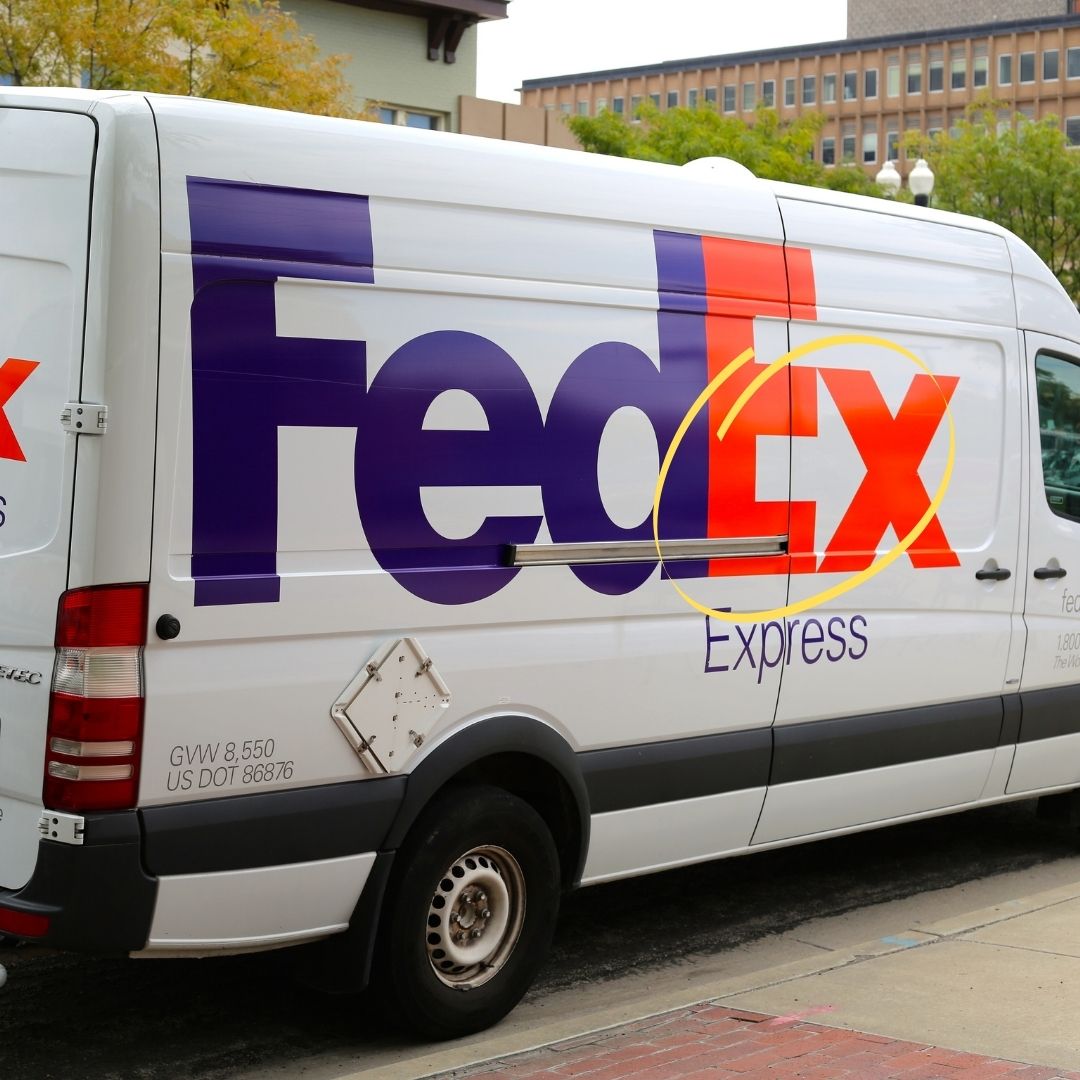
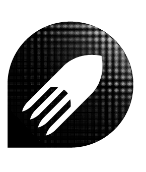
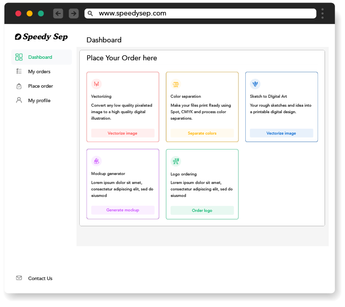
The “empty” space between the E and X form a perfect arrow to suggest speedy service. Not unlike your friends at SpeedySep:)
Subtle symbolism can call attention to a logo. To create a sensational attention-grabber, forget about subtle and go straight to edgy symbols twisted and buried in the text font or other elements.
![]()
If you want to maintain a little geometric dignity, consider overlapping shapes. If you think dignity is over-rated, go straight to an asymmetrical layout that throws the beholder off balance.
Color
You can say a lot with color – that’s why there are so many articles on the internet about color psychology. Opinions differ slightly but the main idea is the same.
Red says energy and excitement, while green says health and prosperity. Purple is majestic, and yellow is fun.
Quiet & Elegant
To take the traditional approach, it is not a bad idea to select colors that speak best for the brand, based on the color psychology charts. One-color logos can be very effective.
![]()
If you want to use more than one color, maybe analogous colors would be a great choice. Using a primary color with one or more tints and shades of that color is a minimalist scheme that time has tested.
To stay with an elegant look using multiple colors, a stained-glass effect is a great way to present a brand identity. It can include borders or a set of colored shapes arranged on a solid background.
High Energy
A more exciting tack includes gradient colors. Select two colors that are complementary so that one fades into the other. You can also use white or black with your primary color for an eye-catching effect.
![]()
If you really want to pump it up, challenge the color wheel. Instead of colors that complement your primary color, use a combination that jars and excites your viewer. Hot pink and orange, bright red and chartreuse – you get the idea.
Typography
Typography is the fonts you use and all of their attributes. Weight, size, italics, underlining, all caps or no caps – they all play a role.
Traditional, Easy-to-Read
The standard corporate look appeals to traditionalists with conservative tastes. Fonts like Times New Roman or Arial are always welcome.
![]()
Typography can also be playful or cozy while using standard fonts that everyone is familiar with. Comic Sans is one of the most common.
Monograms are in vogue for 2021 but they have a timeless quality. It is not the plainness of the monogrammed letter that establishes the brand, it is the colors and graphics that surround it.
![]()
Groundbreaking
Use divergent letters to shake things up. Nothing says “look at me!” like huge lettering at the beginning of a word, tapering down to small characters at the end.
Disappearing letters also scream for attention. When the brand name fades into a pool of liquid or dissipates into a fog, people notice.
If you really want to turn the world on its axis, create custom typography. This can be a complicated process but the result is worth it.
![]()
Graphics
In a logo, the words, colors, and layout tell a story. Drive your point home with images that are carefully selected and inserted to enhance that story.
The Minimalist Approach
The traditional approach is to use graphics that maintain perspective. Designs that include classic portraiture or the hand-drawn look are popular trends.
![]()
Energy Through Chaos
There are no limits in this world. The only constraint you have is that you must match the energy of the design to the energy your client wants to project.
Static motion is the concept of making a component in a still image look like it is moving. This can add a nice bit of energy without overdoing it.
If you want to take it by the horns, complete the design with graphics that are unnerving but bring the eye to the focal point: The brand.
![]()
Conclusion & CTA
A logo is a snapshot of the organization, but there are many ways to capture that image. At SpeedySep, one of our expert designers can work with you to create a work of art that speaks to the consumer.
We look forward to serving you!
Hey, have you tried Speedy Sep ?
Try if free for 7 days and automate your print shop.
deadline

No credit card required.
