How to Create a Gradient in Illustrator

Hello, everybody, this is William at Speedy Sep.
And in today’s video, I’m going to showcase how to create a gradient in Adobe Illustrator.
So the first thing you want to do is open these panels, appearance gradient swatches, and layers.
If you can’t locate them, go to the window on top of your menubar, and locate them.
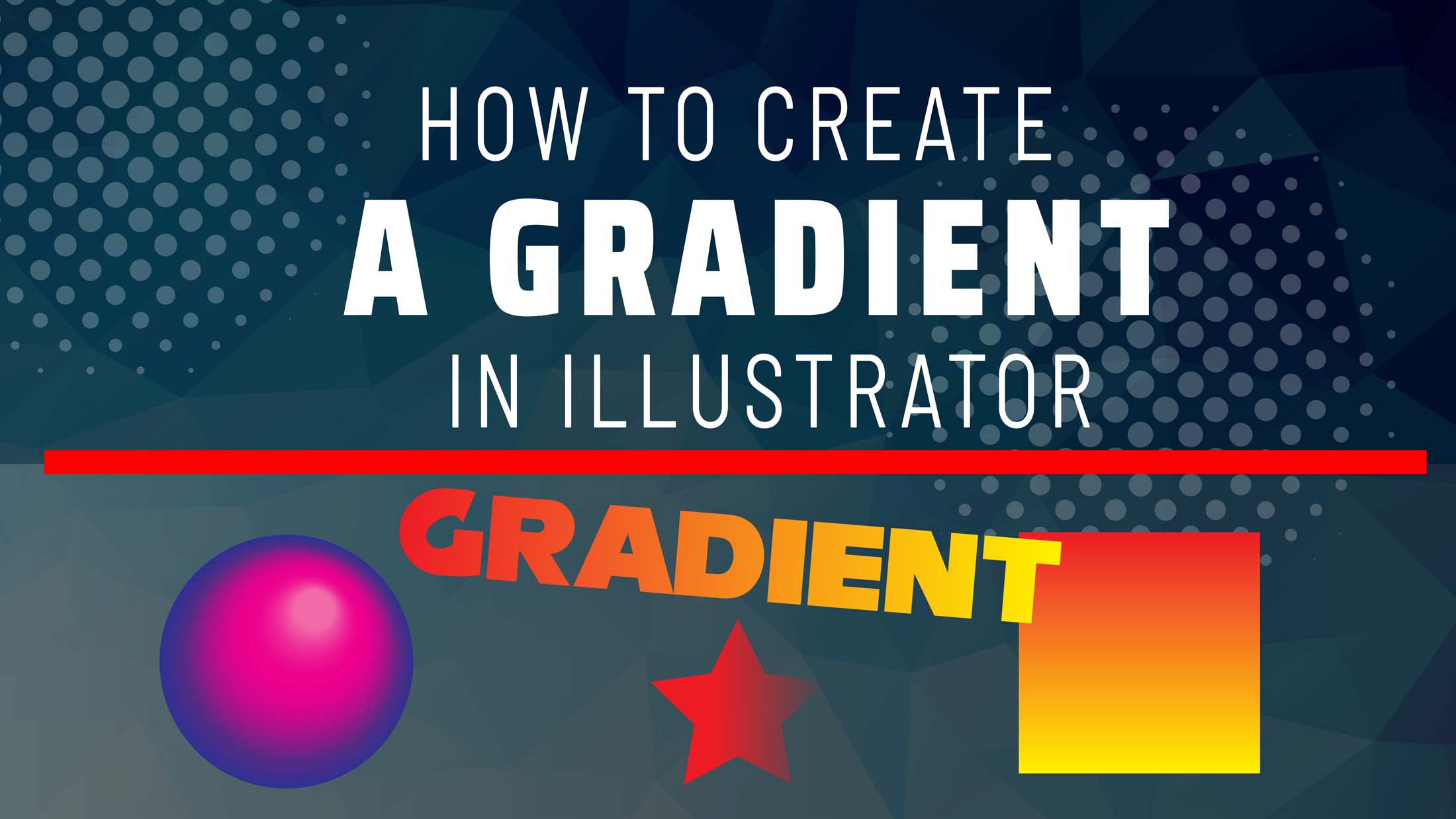
Then I’m going to start with a rectangle to apply a gradient.
Notice the gradient is applied.
Now you can alter the colors by dragging the color swatches into the gradient slider.
You can manipulate them as you please.
You can also change the angles and move the sliders along the way to get a different view on your grading.
Now I’m going to create another gradient, but this time I’m going to select a different shape. If you hold ‘shift’ while you drag, this keeps your shape proportional.
Notice that the last gradient was applied automatically, this time I will select ‘radio’ instead of ‘linear’, and change the location of my sliders, as well as my colors.
By hitting the ‘g’ on your keyboard while selecting your shape, you can also get an additional slider and manipulate it visually.
For the next gradient, I’m going to use a text and use a bulkier, bold font. I’m going to duplicate them by holding ‘alt’ or ‘option’ on the keyboard.
For the first font, notice that I can’t just apply a gradient to a live text. For this step, I’m going to apply ‘none’ to my type.
Then out of the appearance panel, I’m going to add a new fill.
It turns black.
I simply hit the ‘I’ on the keyboard.
That’s a shortcut for the eyedropper tool, then I hover over one of the previous gradients and then right-click.
Now, the reason I duplicate the extra text was to show you what happens if you should leave the fill black instead of ‘none.
I’m going to repeat the steps of adding a new fill through my appearance panel.
Again, I’m going to hit the ‘I’ for the on the keyboard for the eyedropper tool, and hover over the same gradient from before you hit click.
Notice that this time around they created a weird black halo.
That is because of the black fill underneath it.
So to avoid this, you must always set your default text to ‘none’ before you apply a new fill in the appearance panel.
Now for the next tip, I want to show is a gradient filled transparency.
And to demonstrate I’m going to select the ‘star tool’, simply hold ‘shift’ or option to ‘proportionally scale the star’ and fill with any color.
I’m just going to make a solid rectangle to use as a background.
You can either drag it in your layers panels or for PC users, ‘shift, control, left bracket’.
For Mac users, ‘shift, command, left bracket’.
I’ll create another box and fill this black.
Then I’ll lock the two layers, so I don’t accidentally move them.
I’m going to position to star in between both backgrounds.
Then create a gradient with red and black.
Now, notice what happens when I select the black slider from the appearance panel and change the capacity to zero percent.
That transparency seems to look muddy.
This is because the color gradient fills in the blank transition, even though you set the opacity to zero percent.
Now I’m going to duplicate the star, but this time around, I’m going to fill the slider with the red instead of black.
If you noticed, the star appears to have a better transition blend of red.
This is how it looks on a dark background.
And if you wanted the red to look more opaque, you can always make your adjustments in the sliders.
So if you found this video helpful, and want to learn more tips on Photoshop or Illustrator, please subscribe to the channel, as this will encourage us to make more content in the future.
Until then, we appreciate you watching our video.
Hey, have you tried Speedy Sep ?
Try if free for 7 days and automate your print shop.
deadline

No credit card required.
