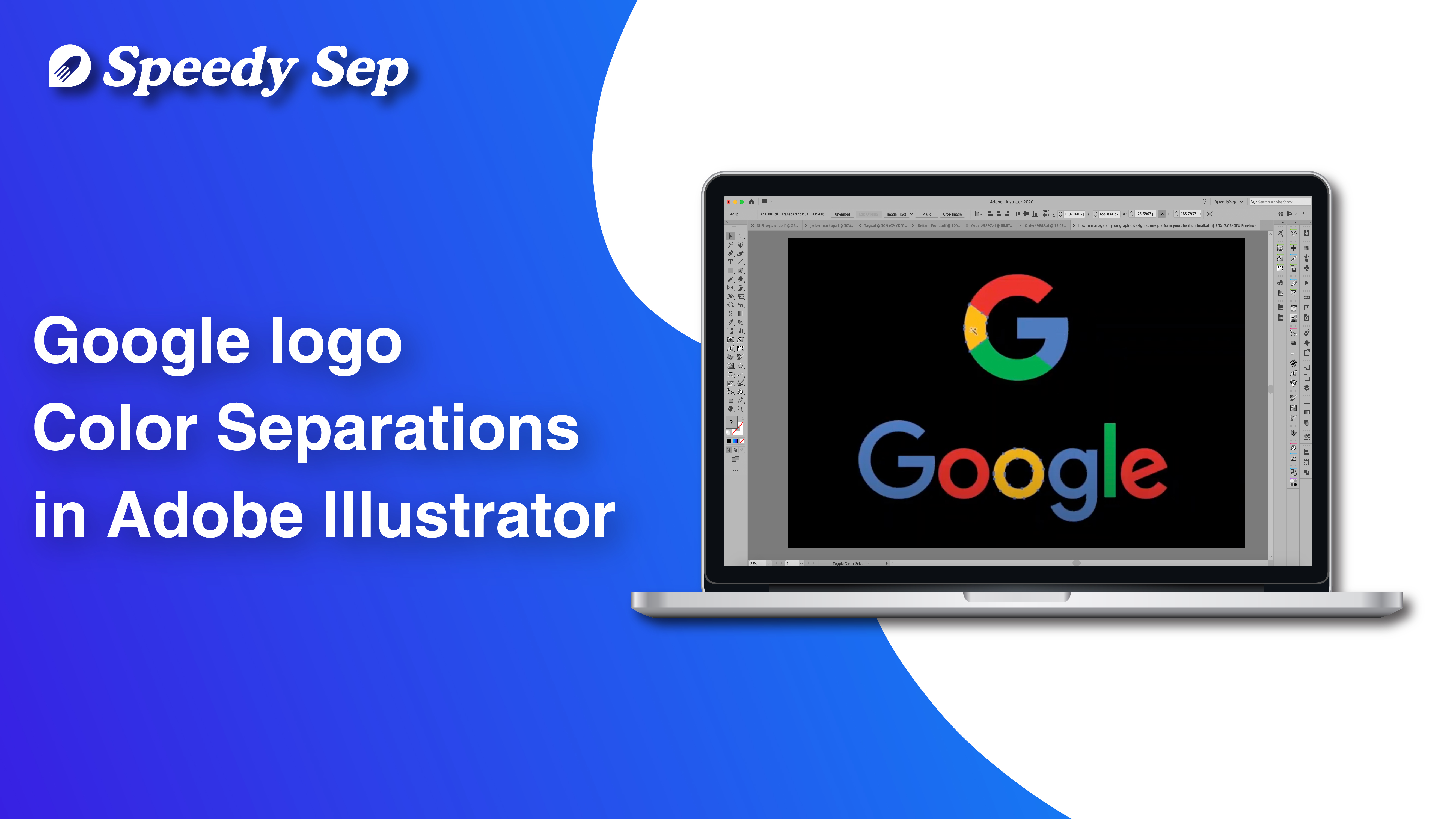
Google logo in Color Separations in Adobe Illustrator | Step by Step Tutorial by Speedysep.com

Hi! This is gabby from Speedy Sep. Today I’m going to give you a tutorial on how to color separate in Adobe Illustrator. I will show you this process using the Google logo.
The reason that I’ve chosen the Google logo today is that the colors are very distinct and the logo itself is very simple. This way I can take you to step by step on how to do color separation for a pretty standard design. For more complex designs, obviously, it will be more tedious. But the steps that you will follow are pretty much the same with some modifications here or there. But in regards to this tutorial, we’ll be using a simple logo just to get the clear-cut steps out of the way. Feel free to follow along.
So, before we start, you’re going to have to create a vector artwork of the logo that you’re trying to color separate. Image trace and just make sure that we’re only using these four colors. As you can see when I go into the recolor artwork tool, we have multiple variations of each color. This is what happens when you do image trace a design oftentimes. But it’s a simple fix we’ll just go in and make them all one solid color. So, once we’ve done that, let’s go into our layers panel and start organizing.
Let’s start with our blue layer and we’ll make a layer for red, and I like to change the tab color to match the color of my artwork. Helps keep me more organized, and then we’ll just make layers for the yellow and the green plates. Now let’s just delete the colors that we’re not going to be using on each layer. So, then each layer itself has its own colors and right now we have a black background. So, let’s just take that off, so we can see all of our layers. Once we hide them and hide them.
We’ll make a layer for a white backing. We’re going to put all of our colors on this layer, make it one standard color, hit unite and let’s put a stroke two points. Now depending on your machine that you’re using for screen printing, obviously, it will never be exact. So, it’s good to put a stroke over your color so that way our white definitely not show through when it’s printed. Now another way we could go about this is by putting a stroke of the color that we are using to increase the print area.
Now either works really depend on your design. You don’t want to add too big of a stroke, we in case it’s going to change the overall design. For the google logo, however, we aren’t changing the look of the design too much. So, it’s totally your choice if you want to choke back on the white or if you want to spread your colors. Spreading your colors is also good, because then they will slightly overlap each other. You decrease your risk of running into the problem of there being gaps between the colors and the short color showing through a white showing through.
Now while we’ve done a successful color separation, this would not be ready for print. And the reason being is that our color swatches are not Pantone colors. I purposely chose to start off without changing them to Pantone colors, just so I could specify now that you cannot do a successful color separation with any sort of system if you do not have Pantone colors set. Pantone colors that are spot colors, not process colors.
So, let’s go into our swatches, and let’s go to the top right corner. We’ll do open ‘Swatch Library’ at the bottom. We’ll go to the ‘Color Books’. Let’s get a Pantone salad coated as long as you pick any sort of Pantone color we’re good. But I’m going to choose this and I’m going to match it to the closest pantones that I can find. Also keep in mind that whatever Pantone color you decide to use here will not affect the color that you’re printing, as that is part of a whole different process. Let me see that because we spread our colors it’s overlapping.
So, let’s just make sure the stroke color on our white plate is not a pantone color, that way we do not print it. We want to use a stroke with any other color that way it will knock out that selection of the white plate. So, that we again do not have any white peeking through our design when it is printed. So, let’s do a one in one. We’ll choke back one, we’ll spread one and that equals two. So, that’s perfect. It’s as if we choked back to or spread all of our colors too sometimes you could just meet in the middle, and there we go.
We have successfully done a simple logo design color separation for screen printing purposes. I hope you enjoyed this tutorial. Thank you so much for watching.

Hey, have you tried Speedy Sep ?
Try if free for 7 days and automate your print shop.
Browse by Category
deadline


